
What on Earth is “Vibe-Codingâ€? Let’s start here, because some of you are scratching your heads. “Vibe-coding†is when someone just feels their way through coding. No plan. No architecture. No documentation. Just vibes. Like, “I think if I paste this snippet from StackOverflow into my PHP file and pray, it might just work.â€
-
Tech Consultant Anees Khan
-
WhatsApp / Call 65-91097721
-
Email Us
What Is a Responsive Website
A Singapore Developer’s Guide to Why Your Website Must Look Great on Every Screen — If You Still Want Customers in 2025.
26 Oct 2025
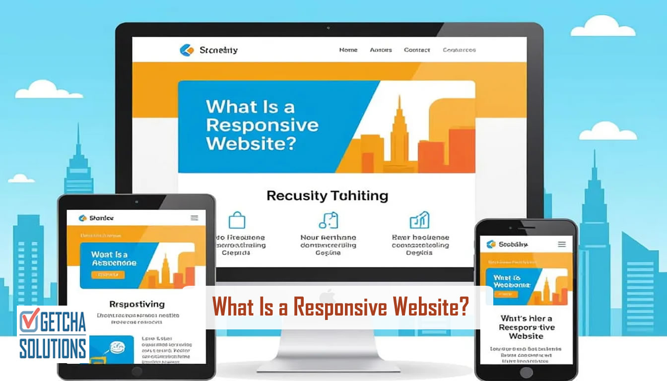
What Is a Responsive Website
The Confused Client (And the Birth of This Article)
It’s been donkey years since the term “responsive web design” was coined. It is now 2025 already. Yet, on almost every phone call, whenever I drop this phrase, “responsive web design”, one of these response typically sprung up.
“Yes, we want it responsive, not slow”.
“Yes, we want to be responsive, so must have a proper Contact Us page.”
Last week, a client told me proudly, “Anees, my website is very responsive! My customers message me and I reply fast-fast!” I laughed so hard I almost dropped my teh tarik.
That was when it hit me — I’ve been building websites for decades, and still most people don’t know what a responsive website actually means. And it’s not their fault. “Responsive” sounds like “quick to respond.” Logical, right?
But in web design, it means something completely different — and if your website isn’t responsive, you might be losing half your customers before they even read your headline.
Let’s fix that confusion today — in plain English, no geek-speak, promise.
What People Think It Means
Here are some real quotes I’ve heard over the years:
“Responsive? Oh yes, I reply my customers within 10 minutes.”
“My website already got mobile version lah.”
“It looks fine on my computer, so should be okay, right?”
Wrong, wrong, and so wrong.
A responsive website has nothing to do with how fast you reply or whether you have a separate mobile site. It means your website automatically adapts to any screen — whether it’s a big desktop monitor, a tablet, or your auntie’s tiny Android phone with 300 unread WhatsApp messages.
The Stretchable T-Shirt Analogy
Think of it like this:
A responsive website is like a stretchable T-shirt — it fits anyone who wears it, no matter the size.
If your website isn’t responsive, it’s like a T-shirt that only fits one person perfectly — everyone else looks weird in it.
Or imagine water — you pour it into any glass, bottle, or jug, and it adjusts beautifully. That’s what your website should do: flow and fit into every screen size.
Why It Matters (Even If You Think It Doesn’t)
Here’s where it gets serious. Let’s talk about the three big reasons why this actually matters to your business.
a) 80% of visitors are on mobile
In Singapore, almost everyone browses the web on their phone. Don’t believe me? Look around any MRT cabin. If your website only looks nice on a desktop, you’re already invisible to most of your audience.
b) Google ranks responsive sites higher
Google uses mobile-first indexing. That means it checks your mobile site first when deciding your ranking. If your site looks like a broken puzzle on mobile, Google will politely push you down the list — like that kid in school who didn’t do his homework.
c) User trust and conversions
People don’t trust broken-looking websites. If your site forces them to zoom in, scroll sideways, or squint just to read your phone number — they’ll bounce faster than you can say “PayNow.”
I once had a client whose website looked fine on desktop but was a total mess on mobile. We redesigned it responsively — and their enquiries doubled the next month. Same content, same business — just a website that finally worked on phones.
How to Tell if Your Website Is Responsive
You don’t need to be a developer to find out. Here’s your quick DIY checklist:
Open your website on your phone.
- Does it require zooming?
- Do images overflow off the screen?
- Are buttons too tiny for your thumb?
Resize your browser on desktop.
- Grab the edge of your window and drag it smaller.
- If your content rearranges itself neatly, congrats — it’s responsive.
- If it stays fixed or cuts off, it’s not.
Use Google’s Mobile-Friendly Test.
- Just search “Google Mobile Friendly Test” and paste your URL. It’ll tell you straight.
If you see horizontal scrollbars or overlapping text — your site is basically waving a little white flag saying, “Help me!”
Some screenshots of a Responsive Website:


Some screenshots of a non-Responsive Website:


The Old Way vs The Smart Way
Once upon a time (around the early 2010s), people used to build separate “mobile versions” of their sites — like m.yourwebsite.com.
That’s ancient history now. It’s like having two kitchens just to cook the same dish — double the maintenance, double the mess.
A responsive website is one single site that automatically adapts to all screen sizes. It’s cleaner, cheaper, and Google-approved.
Common Myths (and Truth Bombs)
Let’s bust a few myths I hear all the time:
💣 Myth 1: “Responsive websites are only for big companies.”
→ Nope. It’s essential for small businesses, especially if most of your customers come from social media links or WhatsApp shares.
💣 Myth 2: “It’s expensive.”
→ Maybe slightly more upfront — but it saves you tons later in updates, SEO, and customer retention.
💣 Myth 3: “It looks okay on my phone, so it’s fine.”
→ Many phones automatically zoom — it seems okay, but it’s not truly responsive.
💣 Myth 4: “I already have an app, so I don’t need it.”
→ Not everyone will download your app, especially first-time visitors. A responsive website covers everyone instantly.
How Developers Like Me Make It Happen
Here’s a quick peek behind the scenes (minus the geek headache).
When I make a website responsive, I set up rules called breakpoints.
For example:
“If the screen is smaller than 768 pixels, move this menu up, make this image smaller, and stack this text vertically.”
We use flexible grids, fluid images, and frameworks like Bootstrap or Tailwind CSS to make this happen smoothly.
It’s not magic — it’s just careful planning so your site always looks good, whether it’s on a Galaxy Fold, an iPad, or your old office desktop monitor that sounds like a jet engine.
Real-Life Story: The Pizza Shop Problem
One of my favourite stories:
A local pizza shop called me up. Their website looked gorgeous on desktop — full-screen video, beautiful fonts, everything. But when customers opened it on their phones to order, the “Order Now” button was hidden off-screen.
No wonder sales were flat.
I made the site responsive — buttons adjusted, menus collapsed neatly, images resized properly. Within a week, their mobile orders jumped by 60%.
The owner called me and said, “Bro, my pizza didn’t change, only the website did!”
Exactly.
How to Fix It (Without Losing Your Sanity)
If you already have a website that isn’t responsive, don’t panic. You’ve got two main options:
Option 1: Redesign Responsively
Ask your developer (or me 😉) to rebuild your layout using a responsive framework. This ensures every new page you add automatically scales.
Option 2: Tweak What You Have
If it’s a simple static site, sometimes we can add CSS media queries to make it responsive without a full rebuild.
When hiring a developer, ask these questions:
- “Is this design mobile-responsive?”
- “Can I test it on different devices before launch?”
- “Does it work on both Android and iPhone?”
A good developer will show you live demos — not excuses. In this age of AI, responsive websites is a must.
The Bigger Picture: It’s About Respect
A responsive website isn’t just a tech checkbox. It’s about respecting your visitors.
You wouldn’t make customers crouch to read your restaurant menu or tilt their heads sideways to see your signboard. So why make them pinch-zoom your website just to find your phone number?
Good design is good manners — and responsive design is digital politeness.
Try This Right Now
Do a quick test — open your own website on your phone right now.
If it looks weird, stretched, or half of it is missing…
Don’t feel bad — most sites are built that way until someone points it out.
If you want, message me — I’ll run a quick check and tell you how to fix it.
No sales pitch, just a friendly “Hey, your site’s pants are showing.”
Closing Thought
A responsive website isn’t an option anymore — it’s survival.
Your customers are busy, impatient, and scrolling while queueing for kopi.
If your website doesn’t fit their screen, it doesn’t fit into their lives.
So, be kind to your visitors.
Make your website responsive — and make your business truly reachable.
Quick Recap:
✅ Responsive = adjusts to any screen automatically
✅ Improves SEO, conversions, and trust
✅ One site, all devices — no “mobile version” nonsense
✅ It’s not expensive; it’s essential
Bonus CTA:
If you’re unsure whether your website is responsive, try it now or send me your URL. I’ll take a quick look and let you know.
👉 WhatsApp me: wa.me/6591097721
👉 Visit: https://www.getcha.com

Vibe coding looks new, but it’s WordPress all over again. Learn why DIY tech always fails serious businesses and how to avoid costly mistakes.

From "why am I paying for 1001 useless features?" to "this is the best investment ever" - here's the no-fluff truth about Custom CRM development and why it beats paying endless subscriptions for ready-made software.